Project 05 · Identity · 2025/26

nutrimente

A visual identity for an app that brings artificial intelligence and emotions together: it asks how you feel, suggests foods to go with it, and always explains why.
Year
2025/26
Role
Concept, identity, print, app screens
Course
Graphic Design · prof. Enrico Pusceddu · ABA Roma
Grade
29/30
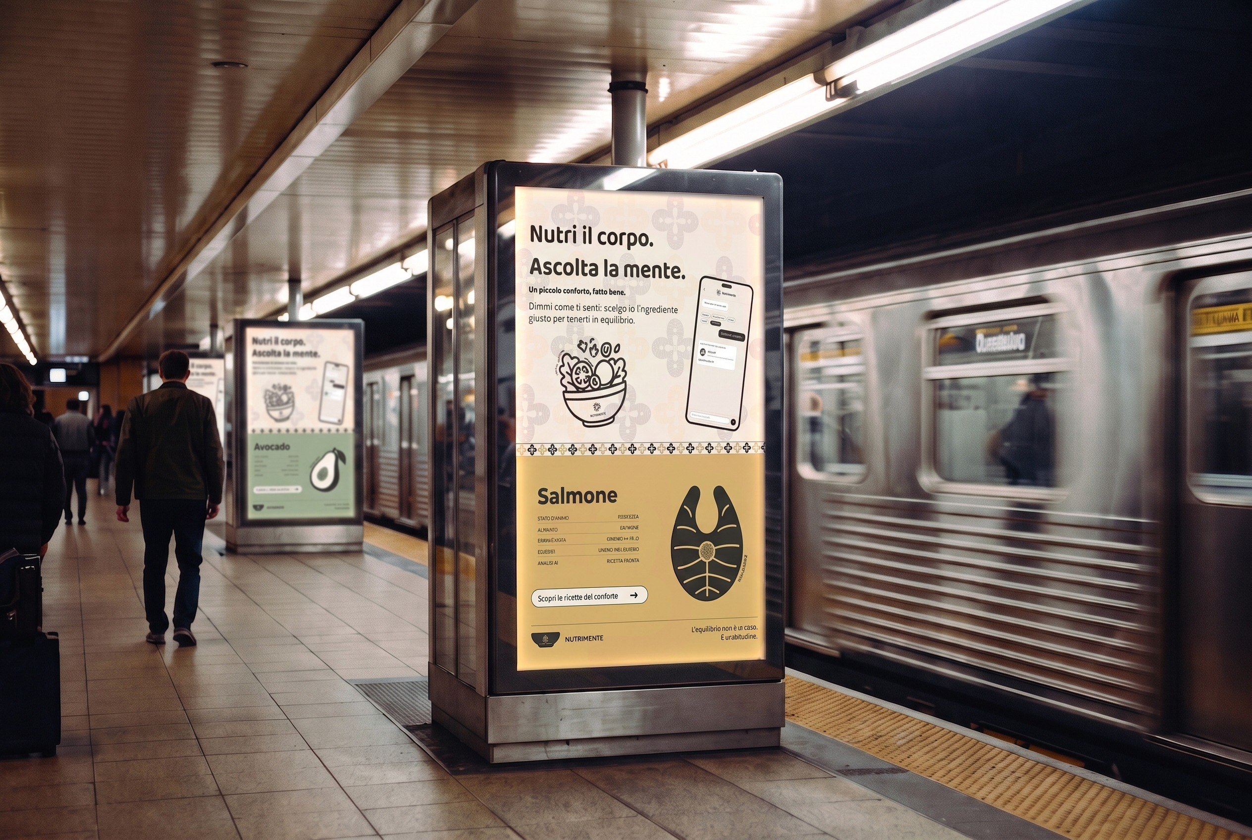
A metro platform with a backlit NUTRIMENTE poster: the payoff Nutri il corpo. Ascolta la mente., a phone with the app, and the salmon card for sadness, while a train passes behind.

Launch campaign · metro station mock-up

The idea

An app that works with any diet: it crosses your mood and your habits with verified nutrition sources, and never gives advice without its reason.

The approach

A quiet identity instead of a loud wellness one: a bowl, three pomegranates, five muted colours, never a face or an emoji.

The result

Logo, palette, type and patterns, a print campaign, a pomegranate recipe leaflet, a booklet, a memory game and the app screens.

01 · Concept

A friend who did their homework

It starts from my own experience. I changed my diet, from eating everything to vegetarian, without any guidance, and the first months were hard, above all for my body, until I learned by myself to listen to what I really needed. NUTRIMENTE is the support I didn't have then, for anyone changing how they eat, whatever their diet.

The name is a play on words. In Italian it joins nutrire, to nourish, and mente, mind. In Spanish it reads almost the same: nutre la mente, it nourishes the mind. In both languages it says the same thing: taking care of the mind, and eating with awareness. The payoff says it in five words: Nutri il corpo. Ascolta la mente.

The AI is an adviser, not a rule. Every food it suggests comes with a transparent card: what it gives you, and also what happens if you eat too much of it. The voice is the one of a caring, well-prepared friend: short sentences, first person, never clinical, never judging what you eat.
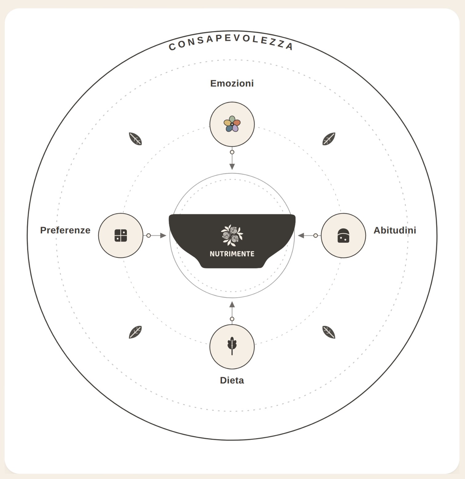
Concept map: the bowl at the centre, connected to four inputs, emotions, habits, diet and preferences, inside a circle labelled awareness.

Concept map · four inputs around the bowl, awareness as the outer ring

02 · The mark

A full bowl, three pomegranates

In Spanish the pomegranate is called granada, like my city. In Granada the fruit is everywhere: on the coat of arms, in the glazed ceramics, in the tile mosaics. Many seeds held together in one skin, an old image of abundance and of unity.

I took three pomegranates and drew them in line, the way they are painted on the ceramics and set into the mosaics at home. Three, for the three voices the project wants to feed: body, mind and soul. They bloom in negative from the centre of a solid bowl with soft edges.

The mark stays warm and human: nothing in it refers to artificial intelligence. It works in one colour only, anthracite on cream or cream on anthracite.
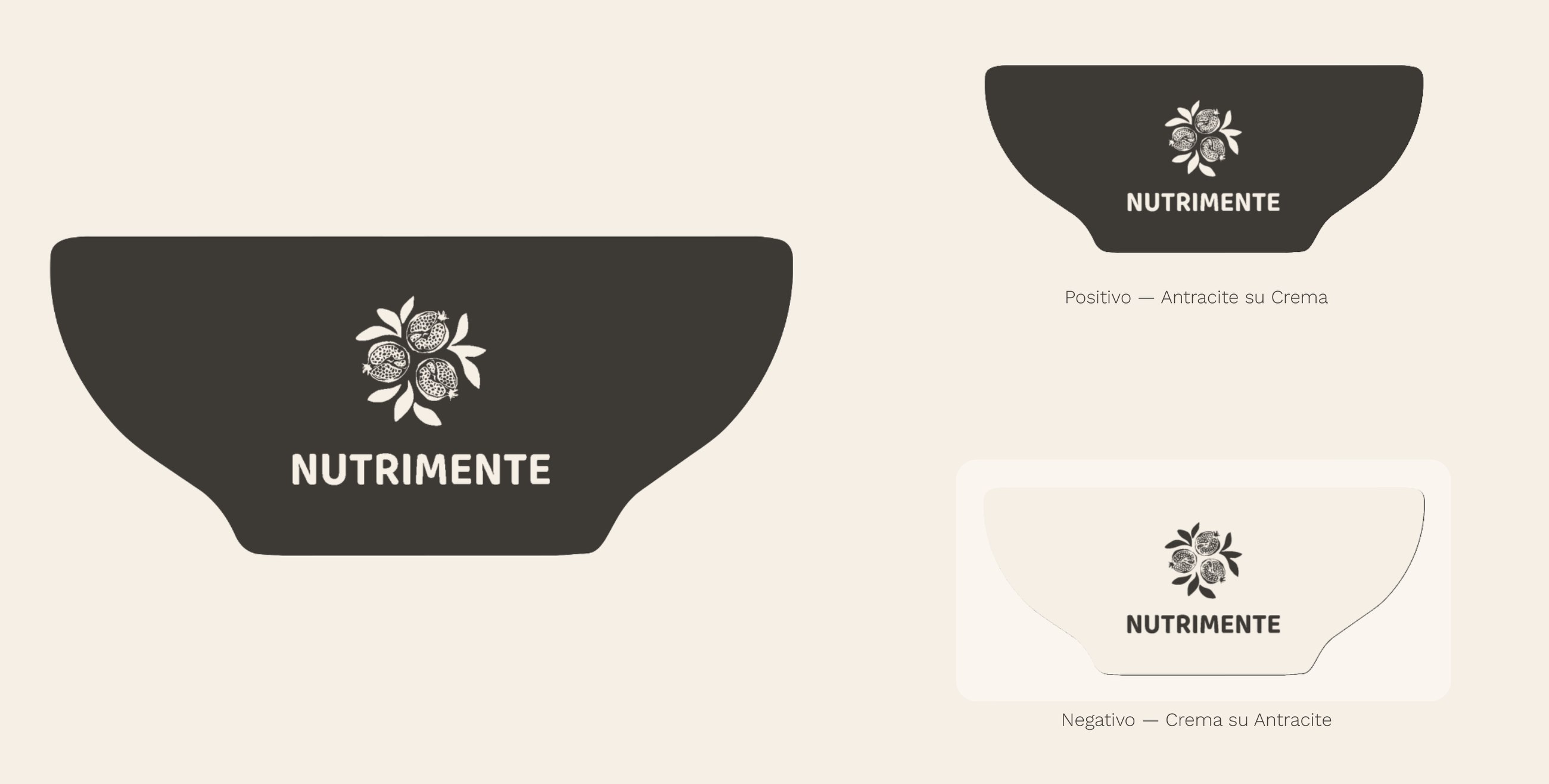
The NUTRIMENTE logo: a dark bowl with three pomegranates in negative and the name, in a large version and in positive and negative.

Positive, anthracite on cream · Negative, cream on anthracite
03 · Colour

«Il colore non fotografa l'emozione di chi apre l'app: fa sentire subito la calma o il sollievo verso cui vuole portarlo.»

Colour doesn't portray the emotion of whoever opens the app: it lets them feel, straight away, the calm or the relief it wants to lead them to.

From the colour slide of the exam presentation.

Five moods, five colours that go the other way

For some emotions the palette avoids the colour you would expect. Instead of red for anger or blue for sadness, it goes in the opposite direction: slate blue to cool the tension down, honey yellow to warm sadness up. Every colour is muted, never pure, and only one mood colour leads each application.

Primary · layout, text, logo
  • Warm cream#F5EFE6
  • Dove grey#ADA396
  • Soft anthracite#3D3935
Secondary · one per mood
  • SageSerenity · #A8B79B
  • TerracottaLow energy · #C97D5D
  • LavenderStress · #B7A8C9
  • Slate blueAnger · #5C7A8A
  • HoneySadness · #D8B978
04 · Type

One voice for the brand, one for reading

Baloo 2, a rounded and solid sans, for the logotype and every title, so the mark and the rest of the brand speak the same language. Work Sans, neutral and readable at small sizes, for long text and the interface. The hierarchy comes from the contrast of weight, not from a second style.

Baloo 2 · titles

Nutri il corpo. Ascolta la mente.

Work Sans · text and interface

Ti ascolto, come ti senti oggi? Scegli lo stato più vicino a te.

05 · Pattern

From Andalusian tiles to Escher

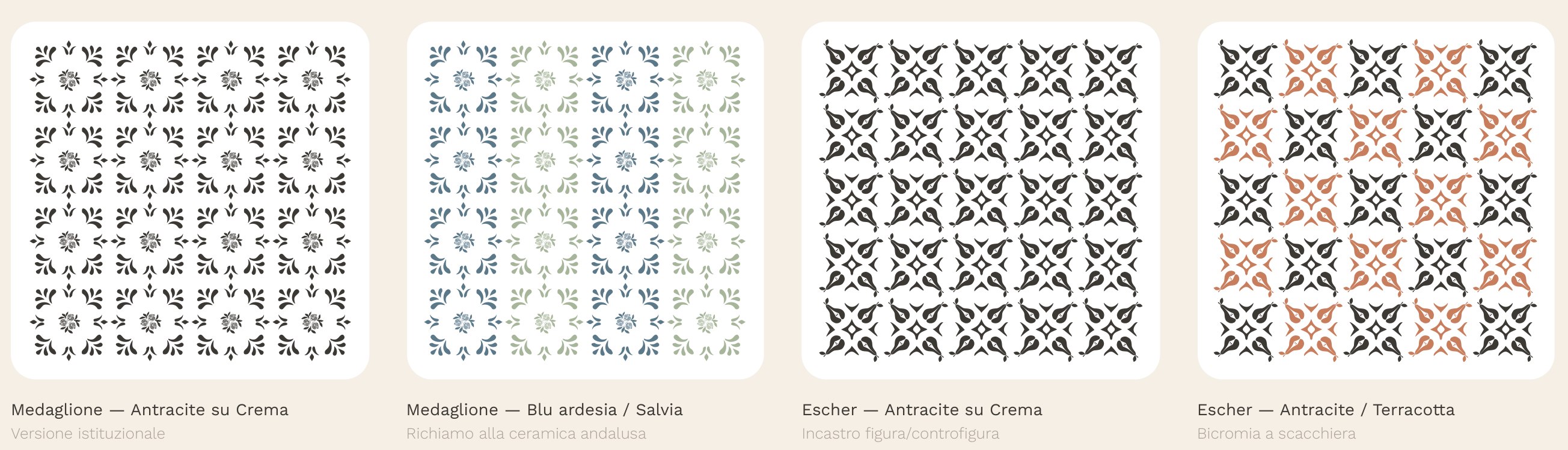
The pomegranate module is developed in two directions: an Andalusian medallion repeated in a grid, like a wall of azulejos, and its rereading as an interlocking figure and ground tessellation, in the manner of Escher.

The same module was taken apart and rebuilt to test the colour harmonies of the palette, and the word nutrimente itself was set in a spiral until it took the shape of a pomegranate.

Four patterns: the medallion in anthracite on cream, the medallion in slate blue and sage, an Escher-like tessellation in anthracite, and the same in anthracite and terracotta.

Medallion · Escher tessellation, in institutional and mood colours

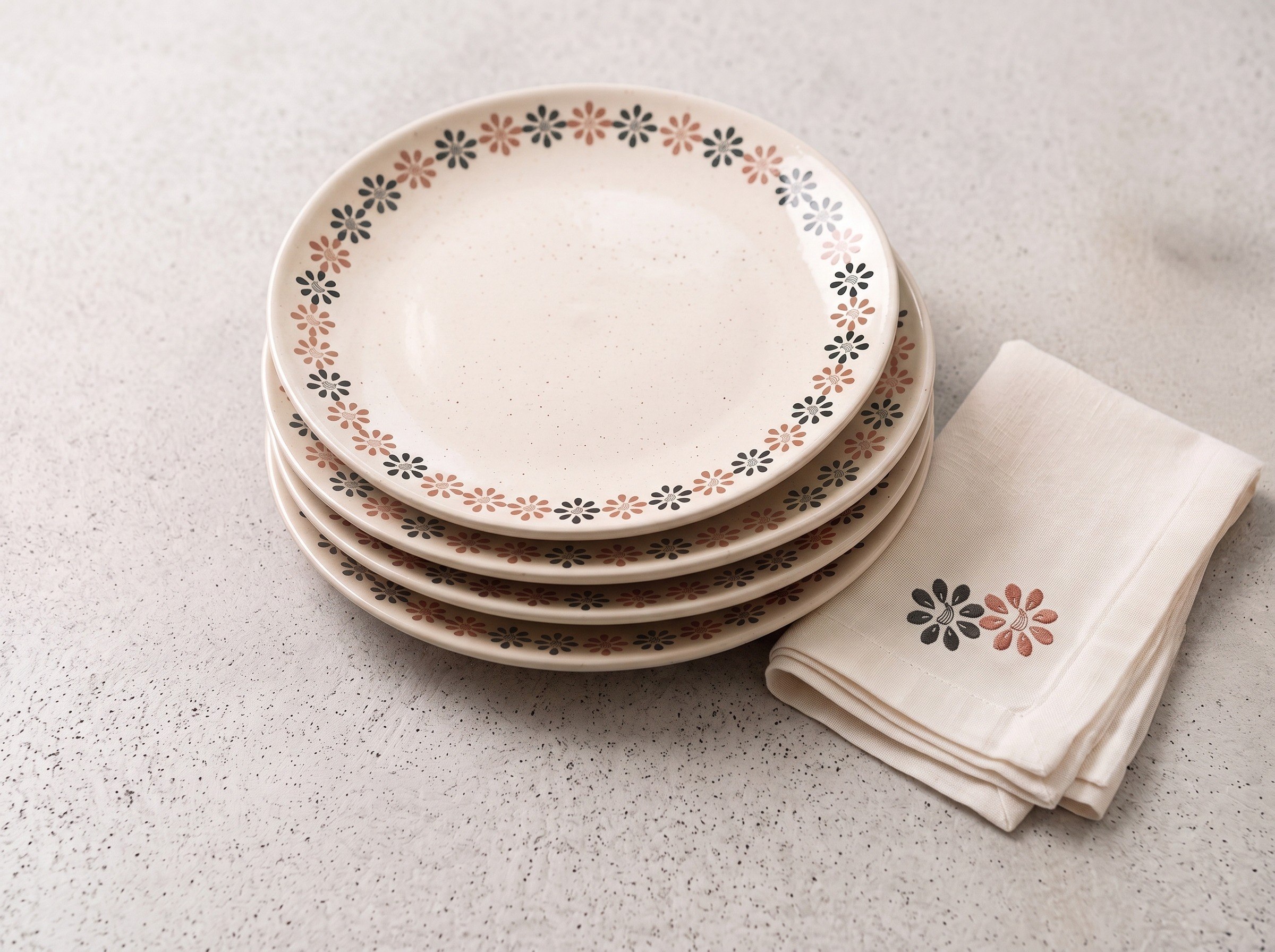
A stack of ceramic plates with the pomegranate flower pattern on the rim and a matching linen napkin.

Applied pattern · plates and napkin (mock-up)

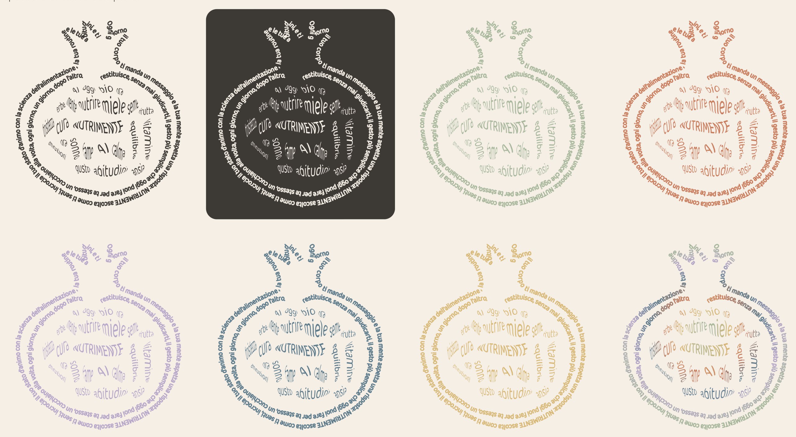
The word nutrimente composed in a spiral in the shape of a pomegranate, in positive, negative and in the five mood colours.

Typographic composition · the name in the shape of a pomegranate

06 · The emotional recipe book

A leaflet that opens like a pomegranate

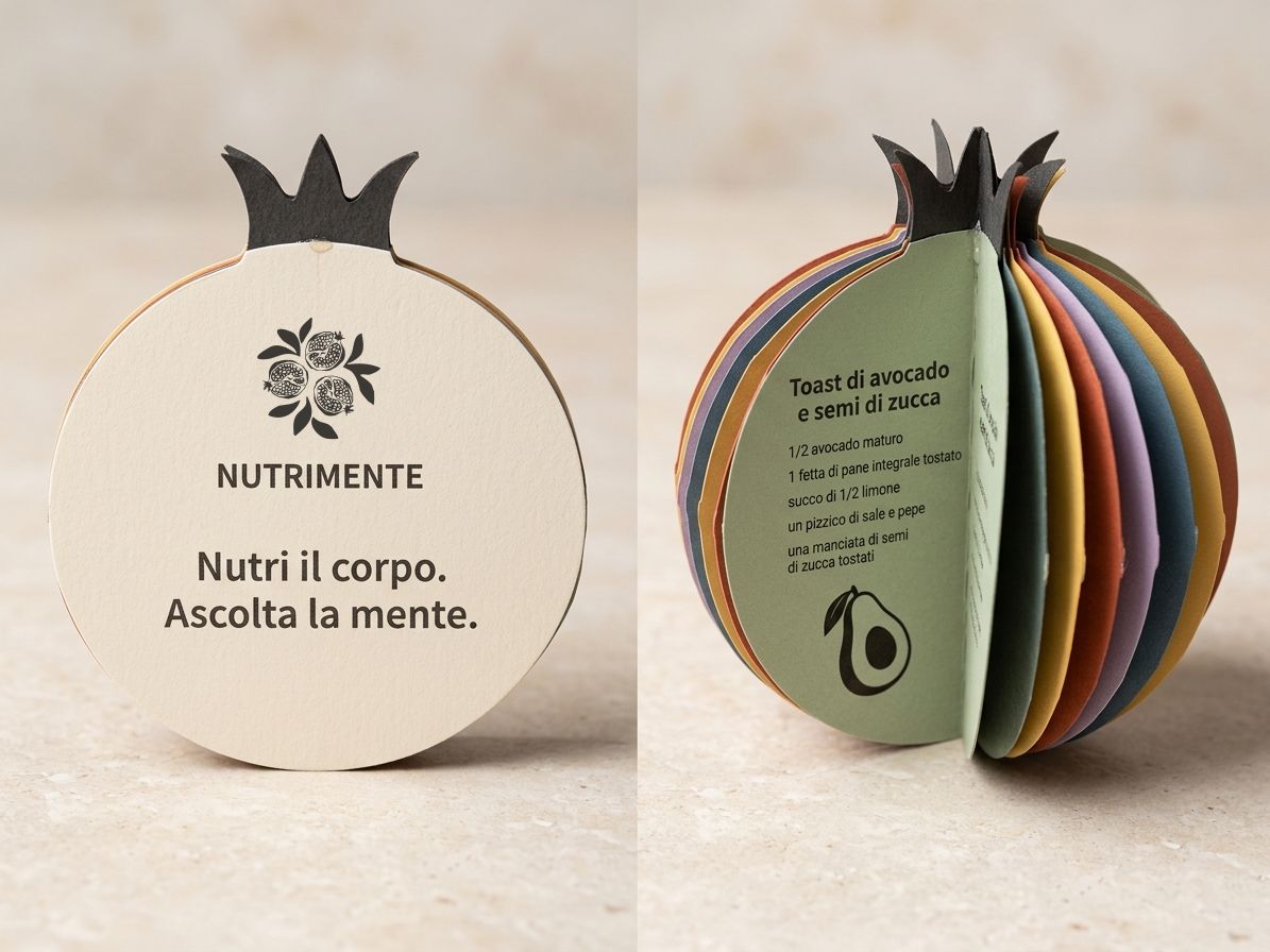
Six pomegranate-shaped cards, folded in half and joined along the fold: closed, it is a flat fruit; open, the sections fan out all around the spine, one for each mood. Open it, then drag to turn it.

Closed: the cover with the logo and the payoff.

The avocado section reads: Avocado. Magnesium, vitamin B6, good fats. Recipe: avocado toast with pumpkin seeds; half a ripe avocado, a slice of toasted wholemeal bread, the juice of half a lemon, a pinch of salt and pepper, a handful of toasted pumpkin seeds. The banana section: potassium, vitamin B6, natural sugars; oat porridge with banana and cinnamon. The almonds section: magnesium, vitamin E, fibre; yogurt with almonds and blueberries. The ginger section: gingerol, vitamin C; a fresh ginger and lemon tea with honey and mint. The salmon section: omega-3, vitamin D, good mood; a bowl of baked salmon, brown rice, cucumber and toasted sesame.

The pomegranate leaflet photographed closed, showing the cover, and open, with its coloured sections fanned out around the spine.

The leaflet closed and open (mock-up)

The cover and the avocado section are the original exam artwork. The other four recipes were completed for this portfolio in the same layout.

07 · Print

One mood, one food, one poster

Five posters, one for each mood, each paired with a food: avocado for serenity, ginger for anger, salmon for sadness, banana for low energy, almonds for stress. The payoff closes every poster and holds the series together.

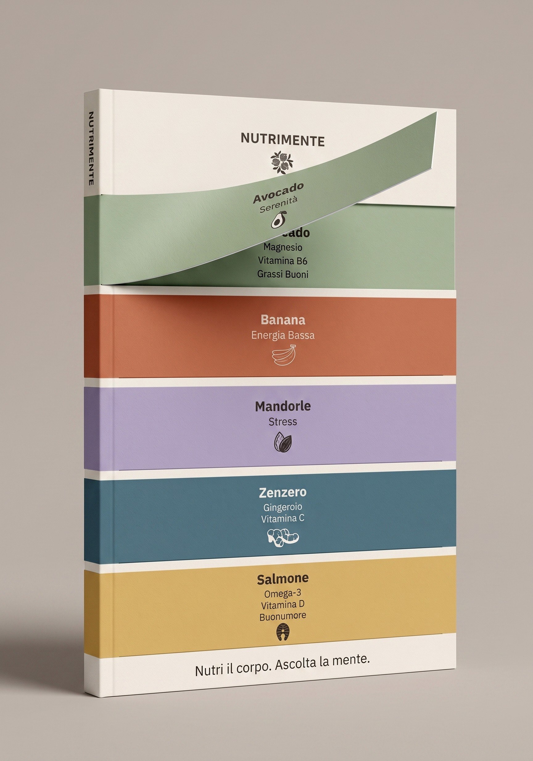
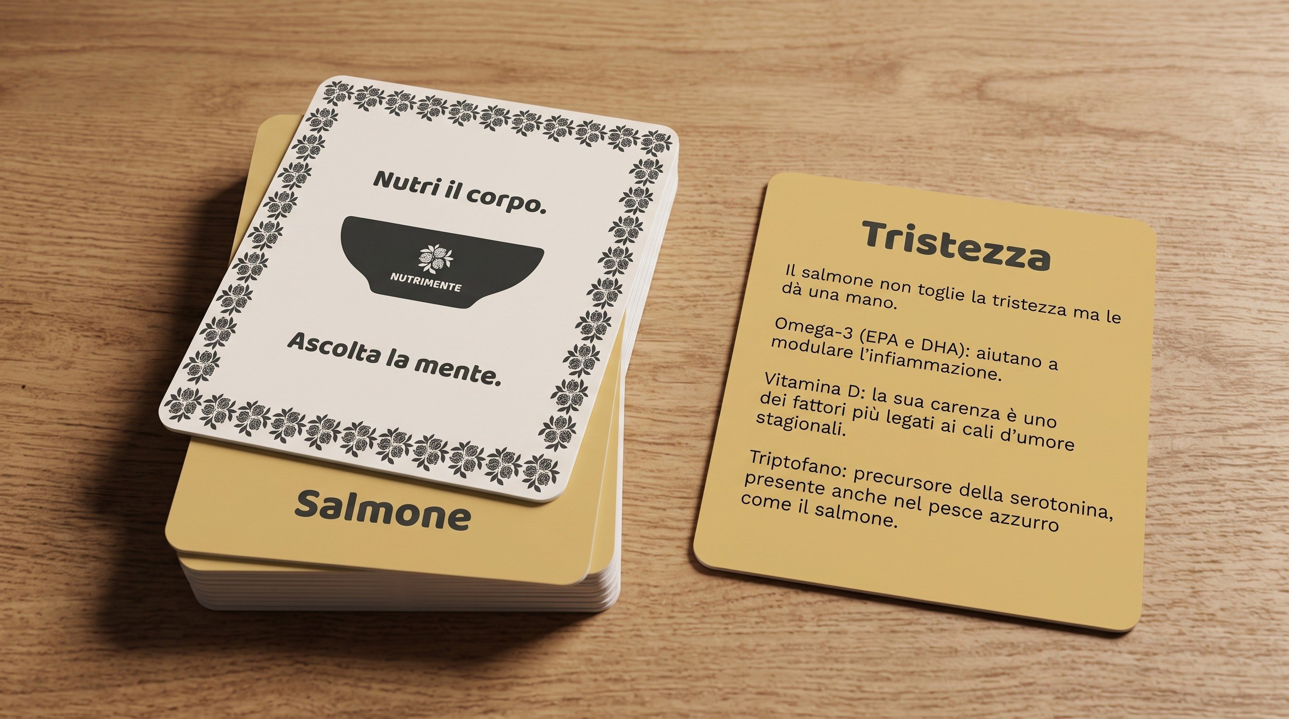
The same pairings return in a booklet with colour bands on the cover and in a memory game: ten cards, five couples, where you match the emotion with the food that goes with it.

The illustrations and layouts are mine; most of the mock-ups that show them in context were generated with AI.

Posters · select one to open it full size

A cooking diary whose cover carries the typographic pomegranate composition.

Cooking diary (mock-up)

Memory game cards on a wooden table: the back with the logo and the payoff, and the sadness card about salmon.

Memory game · ten cards, five couples (mock-up)

08 · The app

"How do you feel today?"

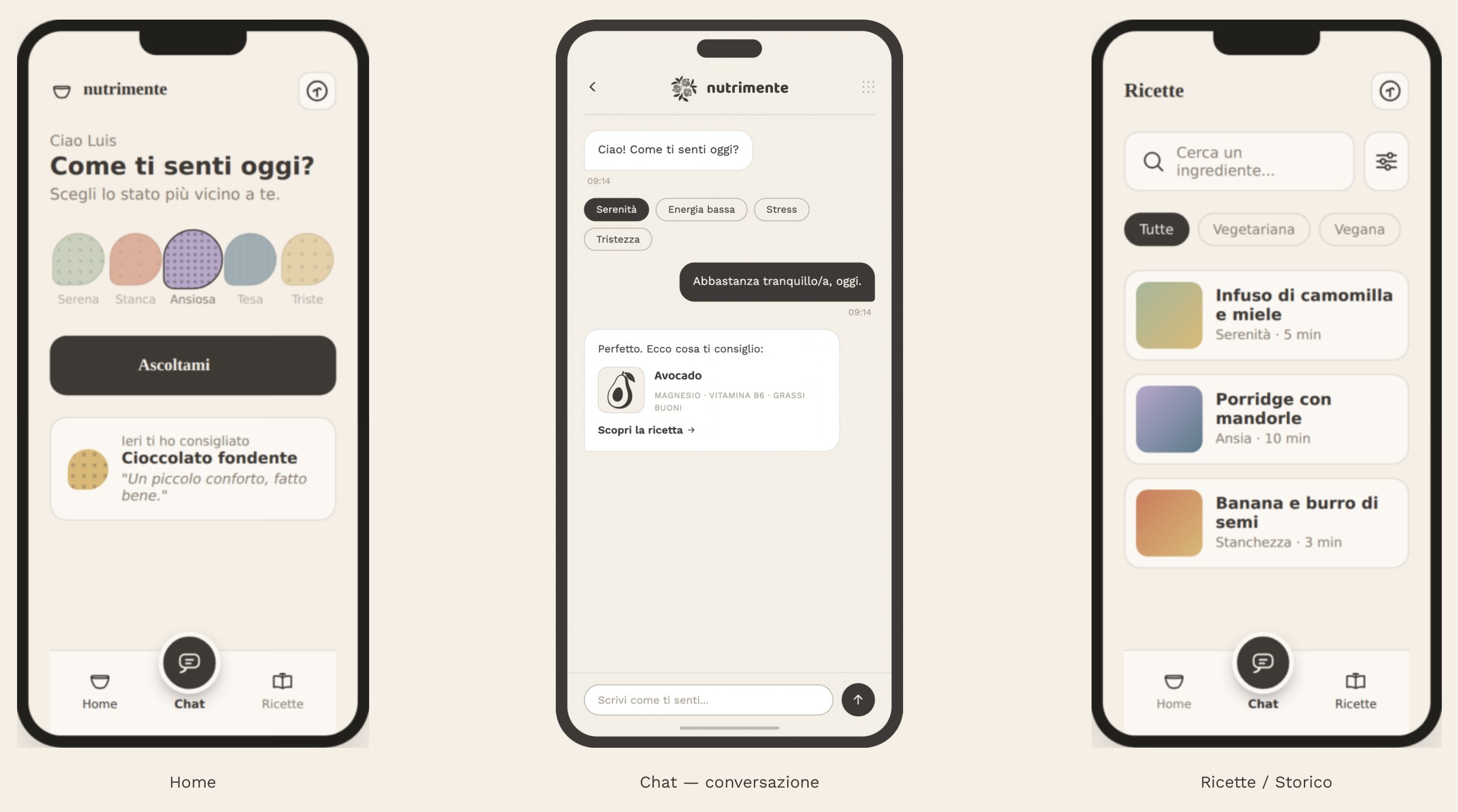
The home opens with an emotional check-in: five colours, one tap. In the chat the app answers like a person and links each suggestion to its transparent card; the recipes section keeps your history.

Three app screens: the home with the question Come ti senti oggi? and five mood circles, a chat where the app suggests avocado, and the recipes list.

Home · chat · recipes and history

09 · What I'd change

The logotype

I would redraw the logotype. At the time I hadn't yet studied in depth how an identity is built, or how a logotype is constructed. Today I would start from its construction: proportions, spacing, and how the word holds together with the bowl.