Project 01 · Typeface · 2025/26

callejera

A typeface born from the ceramic street signs of Granada: the elegance of the originals, redrawn so that everyone can read them, including people with low vision.
Year
2025/26
Team
Barone, Caponecchi, Chessa, Fernández
My part
The "granada" lettering, 27 glyphs, the exam presentation, some mock-ups. My proposal is version 1: together with a classmate, I merged it with her version into the final design.
Course
Lettering · prof. Enrico Bisenzi · ABA Roma
Grade
30/30 cum laude
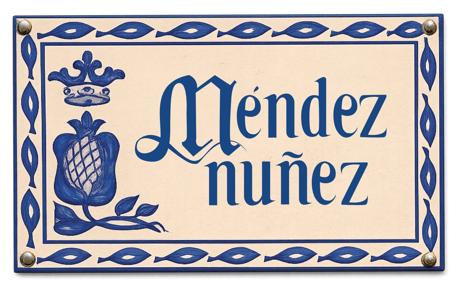
A Granada street sign redrawn with the typeface: blue and cream ceramic, a crowned pomegranate on the left and the street name Méndez nuñez, with a gothic drop cap M.

The street sign redrawn with the typeface and its drop caps

The starting point

Granada's ceramic street signs, a craft tradition from the eighteenth century: beautiful, neoclassical, and not always easy to read.

The approach

Keep the elegance of Bodoni and Didot, simplify the serifs, open the shapes, and make the letters that look alike clearly different.

The result

A digital typeface of 97 glyphs with gothic-inspired drop caps, a specimen, mock-ups and street signs made by hand in clay.

01 · Process

From the wall to the screen

We started from the historic ceramic signs of Granada and from the neoclassical faces behind them, Bodoni and Didot. Then sketches of a skeleton with reworked gothic references, the digital glyphs in BirdFont, and legibility tests at different sizes, with a blur that simulates low vision.

The word granada went through three versions: simplified serifs first, then a further simplification, then the final stylisation.

The word granada in four versions: the original from the historic sign, test 1 with simplified serifs, test 2 with further simplification, and the final version.

Original sign · test 1 · test 2 · final
02 · The goal

«Trasformare la tradizionale segnaletica ceramica di Granada in un carattere tipografico digitale completo, mantenendo l'eleganza neoclassica dell'originale.»

Turn the traditional ceramic signage of Granada into a complete digital typeface, keeping the neoclassical elegance of the original, while making it far easier to read, for everyone.

From the design goal of the exam presentation.

03 · Design for All

Letters that can't be confused

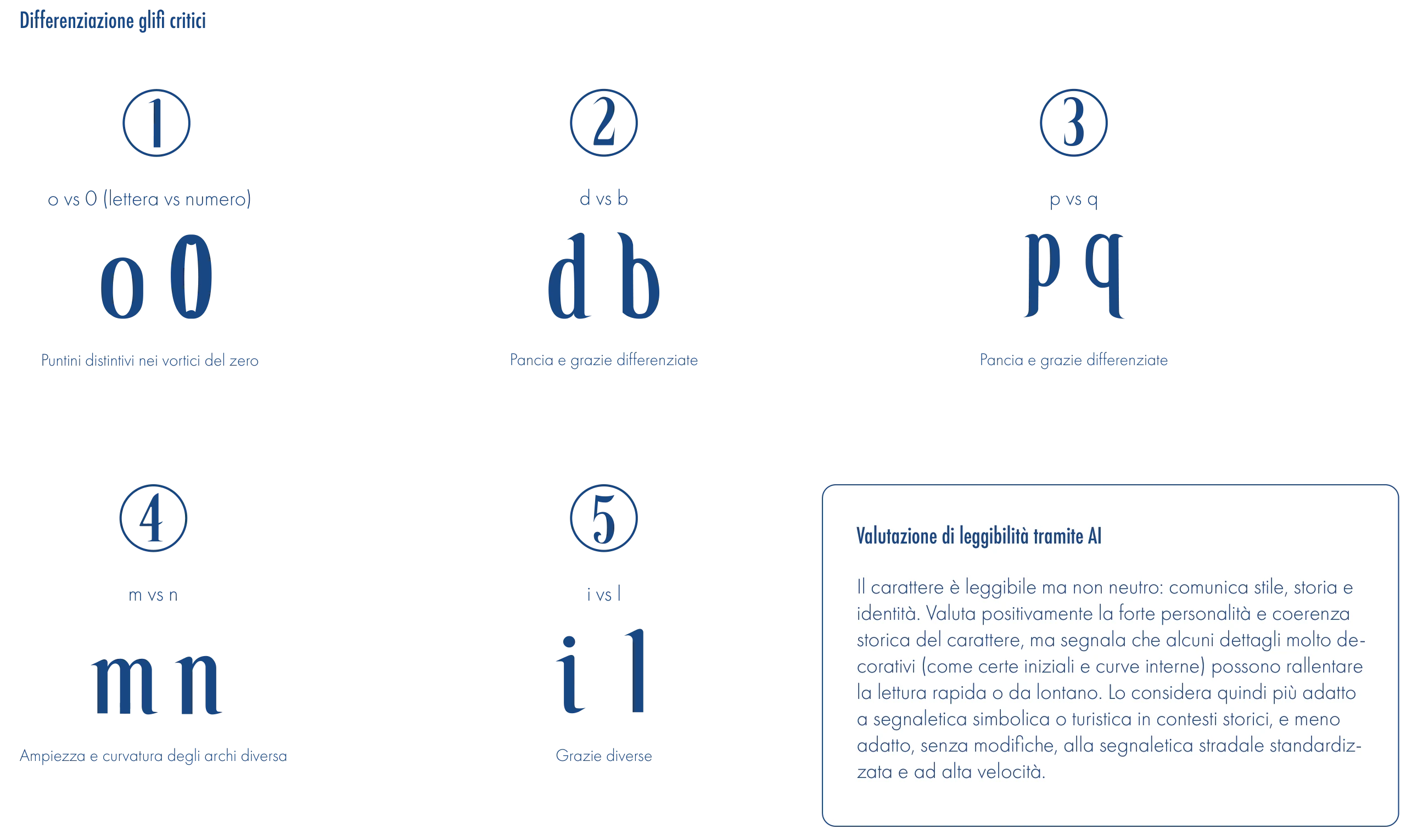
The critical pairs were drawn apart on purpose. The zero carries small dots in its swirls, so it never reads as an o. The bowls and serifs of d and b, p and q are different, not mirrored. The arches of m and n change in width and curve, and i and l have different serifs.

The x-height is generous and constant, the contrast marked but the serifs softened: the neoclassical identity stays, the effort of reading goes down.

Five critical pairs set in the typeface: o and 0, d and b, p and q, m and n, i and l, each with a note on how they differ.

Critical pairs · o 0, d b, p q, m n, i l

04 · Try the typeface

Write a street name

This is the real font file. Type anything, change the size, and use the blur to see how the letters hold up for someone with low vision.

97 glyphs: Latin alphabet, figures, punctuation, accented vowels, ñ, ¿ and ¡. The capitals are decorative drop caps, meant for initials; letters the font doesn't include appear in a fallback face.

05 · Drop caps

Gothic, but quietly

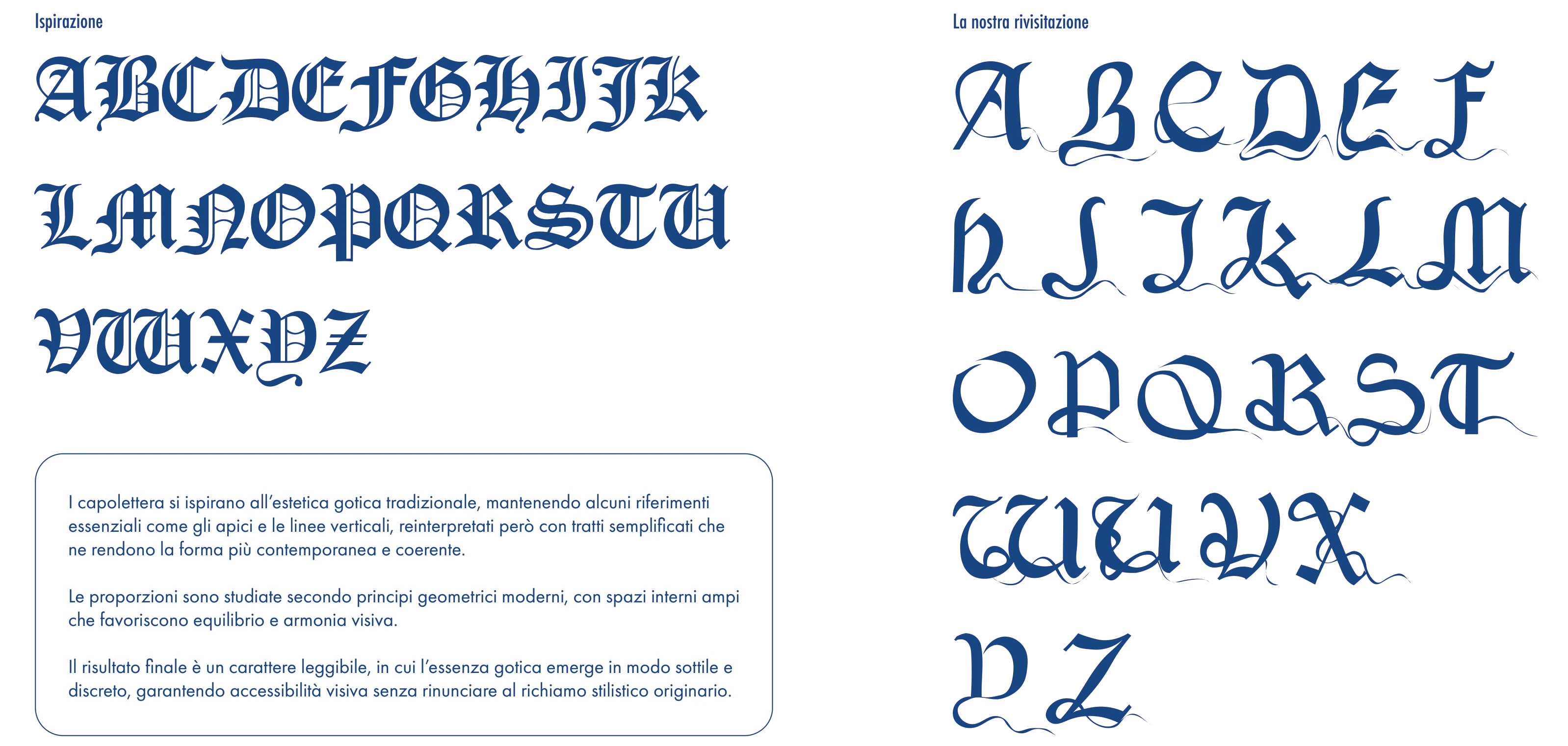
The drop caps start from traditional gothic letters and keep only what is essential, the apexes and the vertical lines, redrawn with simpler strokes and wide inner spaces. The gothic soul shows through in a subtle way, without costing legibility.

Two alphabets of capitals: on the left the historic gothic inspiration, on the right the redrawn drop caps of the typeface, lighter and more open.

Inspiration · our redrawing

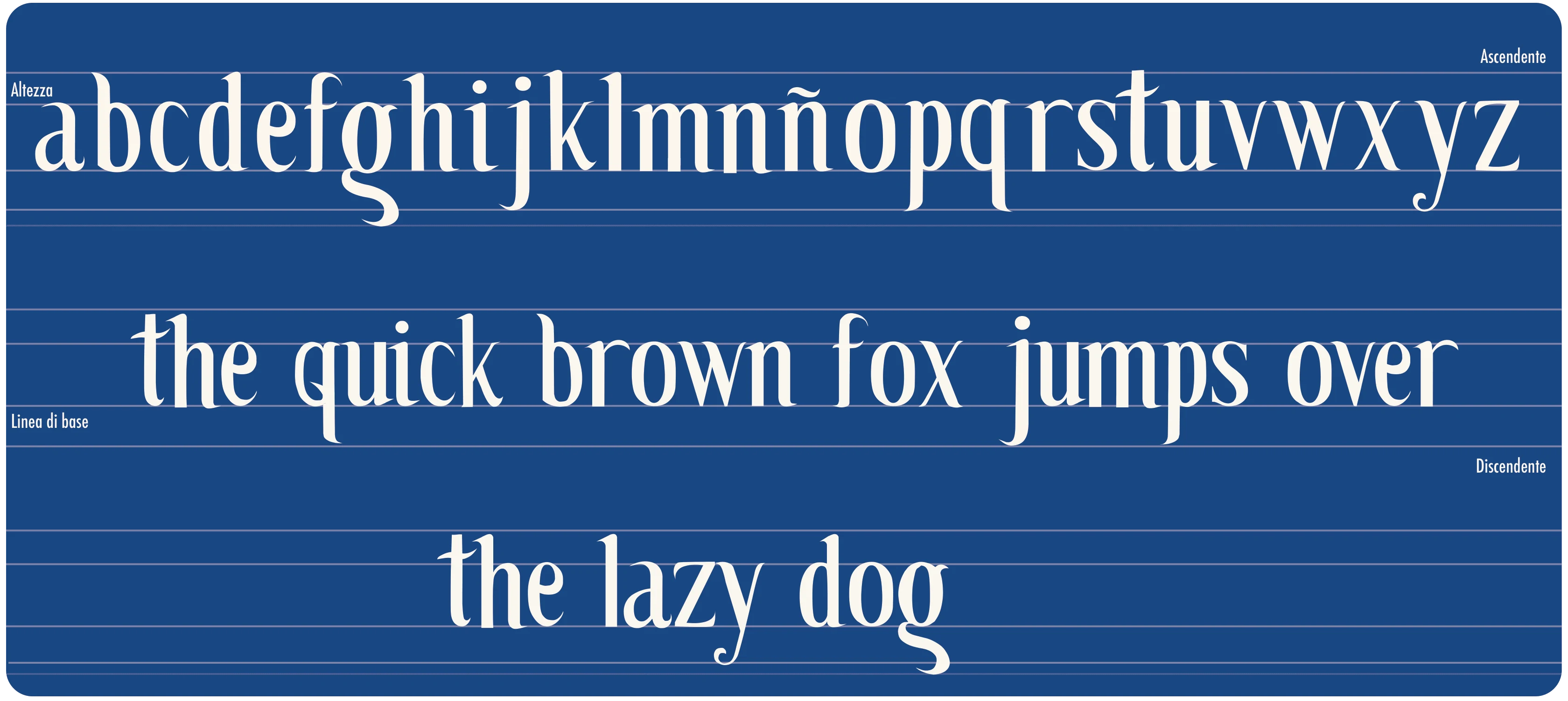
Specimen on a blue background: the lowercase alphabet with ñ and the sentence the quick brown fox jumps over the lazy dog, with guide lines for x-height, baseline, ascenders and descenders.

Lowercase specimen

06 · Applications

Back to the street

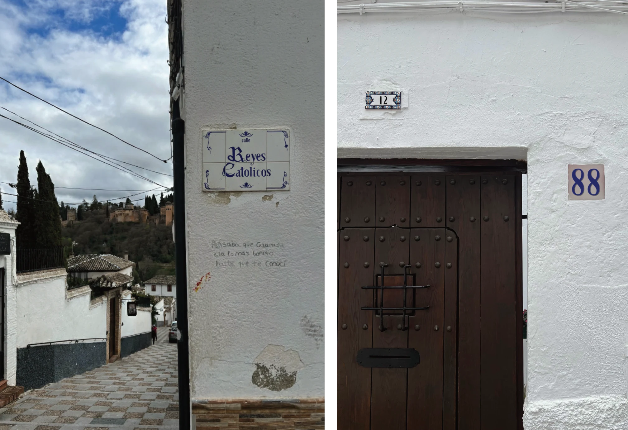
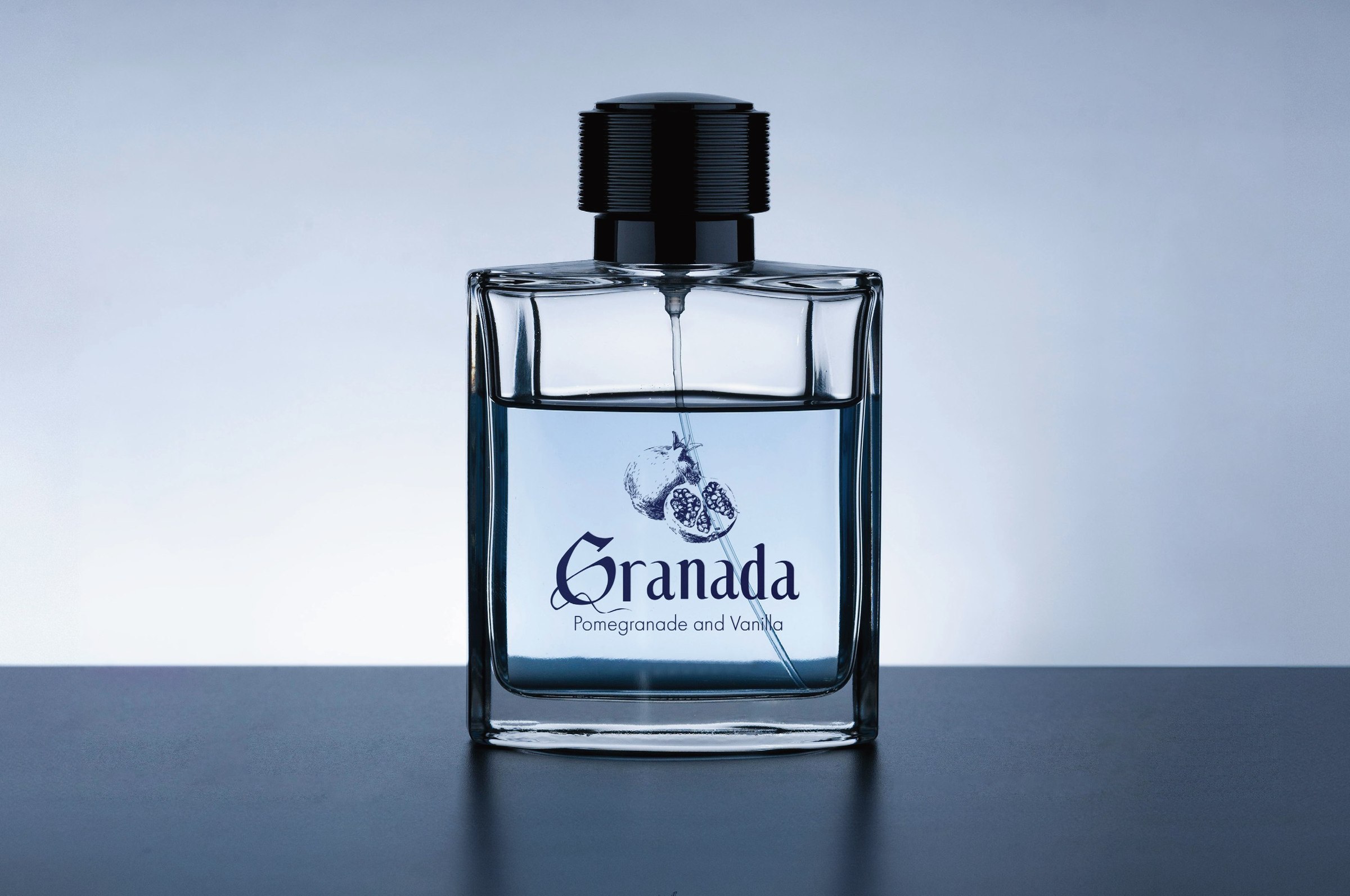
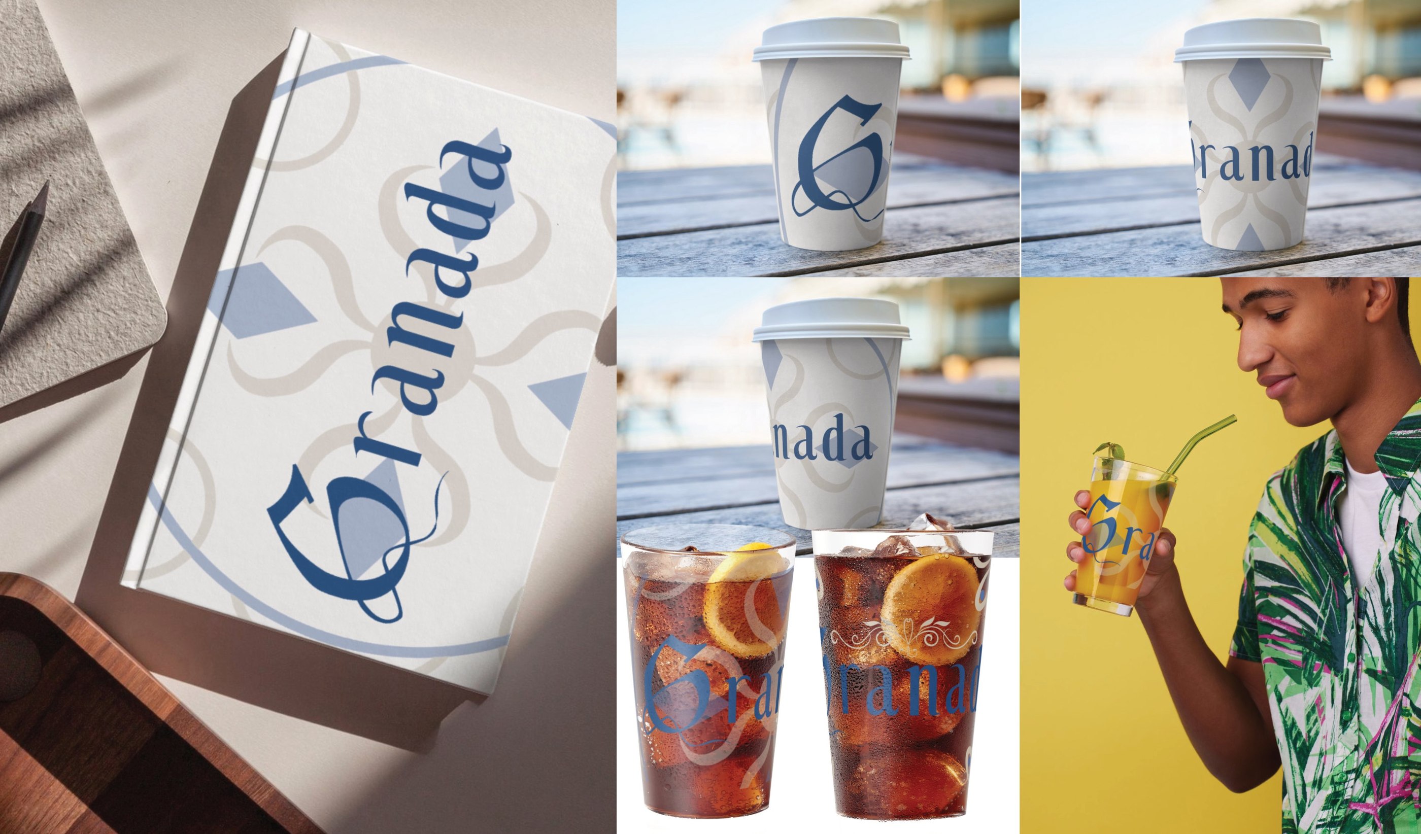
The new signs placed on the walls of Granada, and the typeface carried onto a calendar, a perfume and packaging. In editorial use it was paired with Futura: Callejera tells the story, Futura does the reading.

The typeface and the designs are ours; most of the mock-ups that show them in context were generated with AI.

Two photographs of white walls in Granada with the new ceramic signs: the street sign Reyes Católicos on a corner above a sloping street, and the house numbers 12 and 88 beside a dark wooden door.

Street mock-ups, Granada

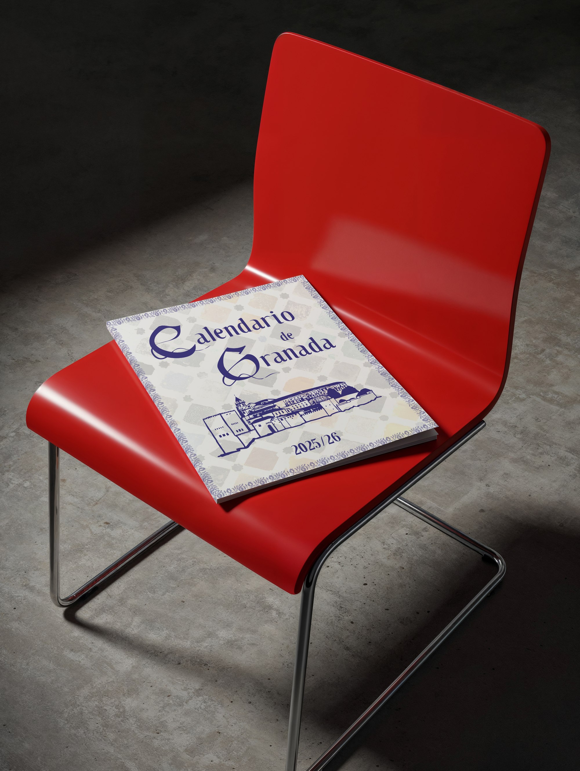
A printed calendar set in the typeface, resting on a red chair in a dark room.

Calendar (mock-up)

A square perfume bottle with a pomegranate drawing and the word Granada in the typeface, above the line Pomegranade and Vanilla.

Perfume, paired with Futura (mock-up)

Packaging and drinks with the word Granada and a large G: a box, paper cups and iced tea glasses.

Packaging (mock-up)

07 · Behind the scenes

Clay, by hand

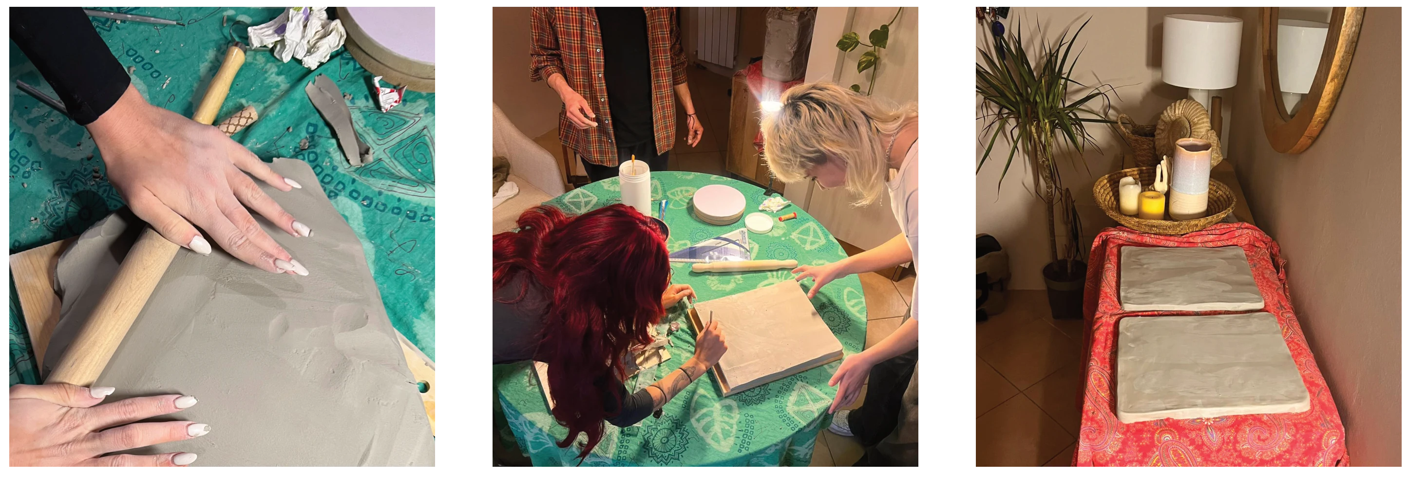
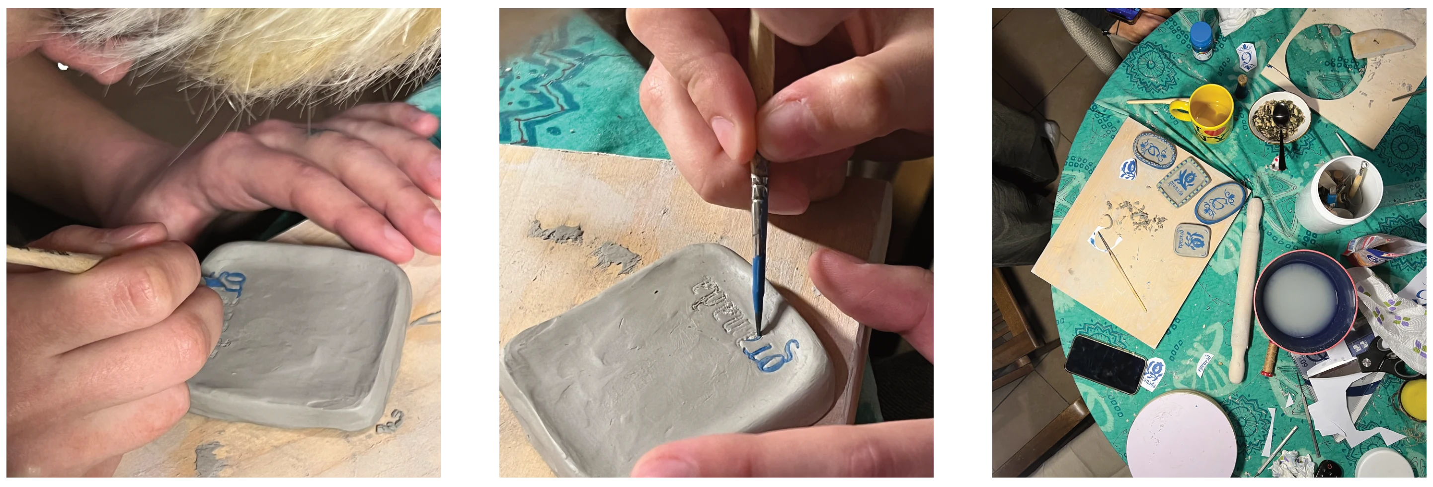
To give back the material feel of the originals, we bought white clay and worked it by hand, recreating Granada's street signs with the new typeface and its drop caps. With the same technique, on a small scale, we made magnets: real souvenirs, to test how the letters read in a pocket-sized, commercial format.

Three photographs of the workshop: hands rolling out white clay, people working at a green table, two clay tiles drying on a red cloth.

The street signs, in clay

Three close-ups: fingers pressing clay, a brush painting letters in blue on a small clay tile, and a table with paints and finished magnets.

The magnets

08 · What I'd change

Test it with real readers

Our legibility checks were a blur simulation and an AI review. The review found the typeface readable but not neutral: some decorative details slow down quick reading from a distance, so it suits historic and tourist signage better than high-speed road signs. Next time I would test it with people with low vision and dyslexia, and let their reading decide how far the drop caps can go.