Project 03 · Magazine · 2024/25

crudo.

An independent photographic magazine that uses food as a lens on society. Issue 00 asks one question: what does a culture choose to throw away?
Year
2024/25
Role
Concept, naming, identity, editorial design, campaign
Course
Design for Publishing · prof. Francesco Mazzenga · ABA Roma
Grade
30/30 cum laude
Paper
Favini Shiro Echo, 100% recycled · cover 300 g/m², inside 100 g/m²
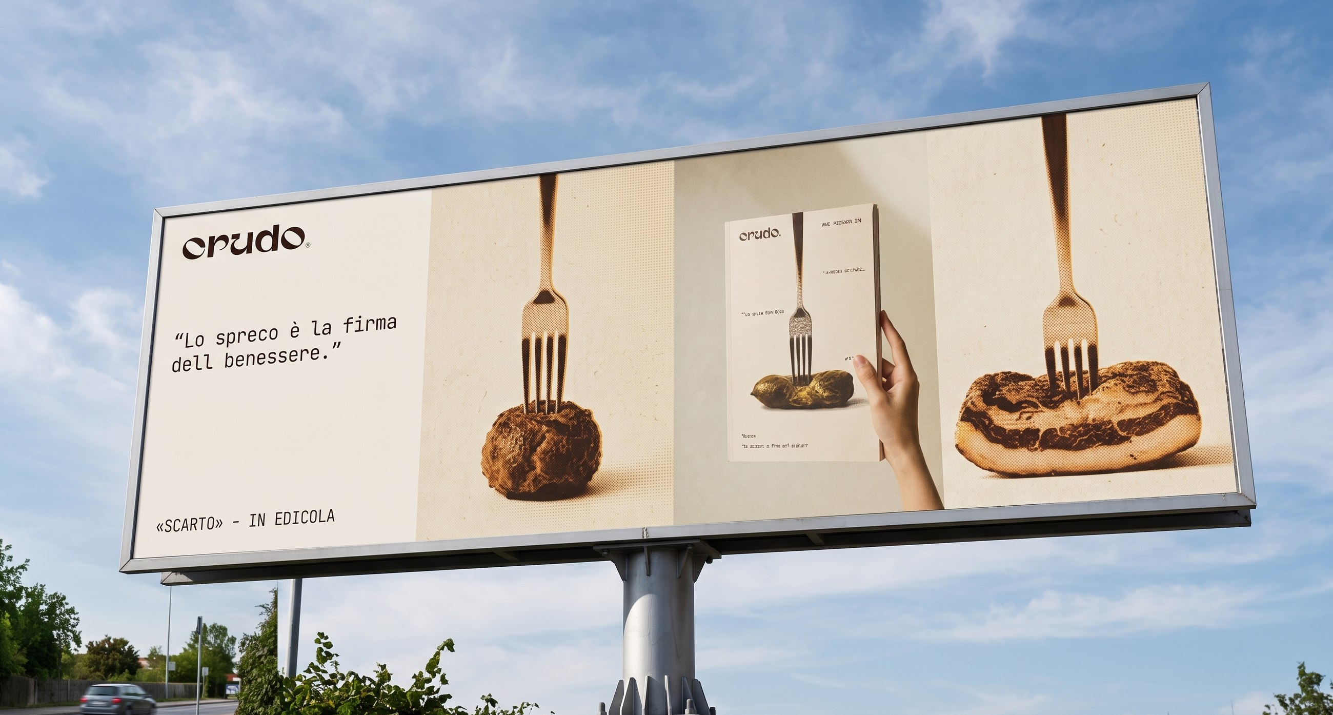
A 6 by 3 metre roadside billboard for crudo.: the claim Lo spreco è la firma del benessere on the left, and three still lifes on the right, each with a fork stuck in from above: a meatball, the magazine held in a hand, a piece of pork rind.

Launch campaign · roadside billboard, 6 × 3 m

The problem

Food media make waste look either appetising or disgusting. Almost nobody asks what we throw away, and what that says about us.

The approach

A raw, unfiltered magazine: a name, a cover device and a two-typeface system built around one sentence.

The result

A printed 68-page pilot issue, a full launch campaign and a grade of 30/30 cum laude.

01 · Concept

Waste as a document, not a mistake

Issue 00 is about food waste: what a society decides to throw away, and what those choices reveal about its priorities.

The starting point is Georges Bataille's idea of dépense: excess is not an accident but a necessary product of every system of production. The more a society consumes, the more it wastes, and that waste measures its wellbeing better than any statement of intent.

The magazine is for readers between 25 and 45 who read essays, care about unconventional food culture, work in critical gastronomy as chefs or sommeliers, or work in editorial design. People who read food as a way to read society.
02 · The motto

«Lo spreco è la firma del benessere.»

Waste is the signature of wellbeing.

683 g
food wasted per household each week, Italy 2024 (Waste Watcher report)
517 kg
municipal waste per person each year, European Union 2024
59 mln t
food thrown away in Europe every year

The figures that open the issue, as cited in the project report.

03 · The name

crudo /ˈkru·do/ it., adj. raw

Before it is a noun, crudo is an adjective: something that has not been cooked or processed, that is blunt and unfiltered. The name sets the magazine against the glossy look of food lifestyle and states its method from the cover: the raw material, without staging.

The wordmark is set in Gunter, all lowercase, with a full stop in the same colour as the name: a minimal signature, repeated identically on every surface. It exists in only two versions, positive and negative, never in colour.

04 · The cover

One raw bean, one fork, a lot of empty paper

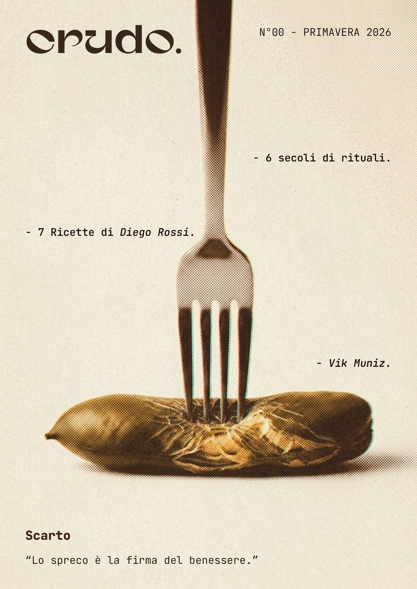
The cover isolates one subject: a raw bean, pierced from above by a fork, on paper that is about 65% empty. It is not leftover food: it is the ingredient before any cooking and any judgement, the same raw matter that gives the magazine its name.

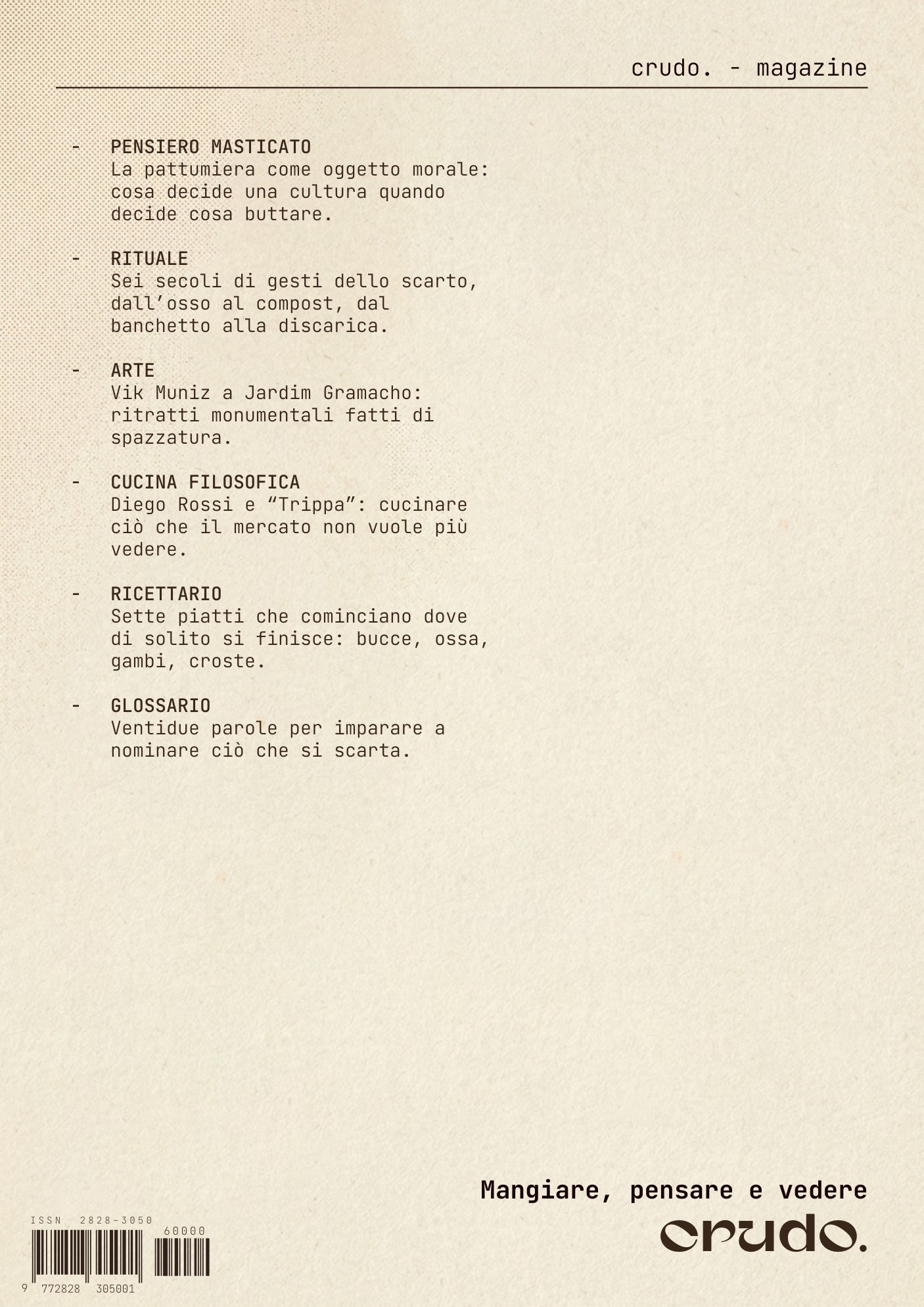
The layout is a grammar that can repeat for every future issue, changing only the subject and the accent colour. The back cover doesn't repeat the front: it is a second table of contents, and its lower half stays empty on purpose, because emptiness is the theme.

Move over the covers: the cursor becomes a linen tester, the lens printers use to check paper and dots.

05 · Type and colour

Two typefaces, no exceptions

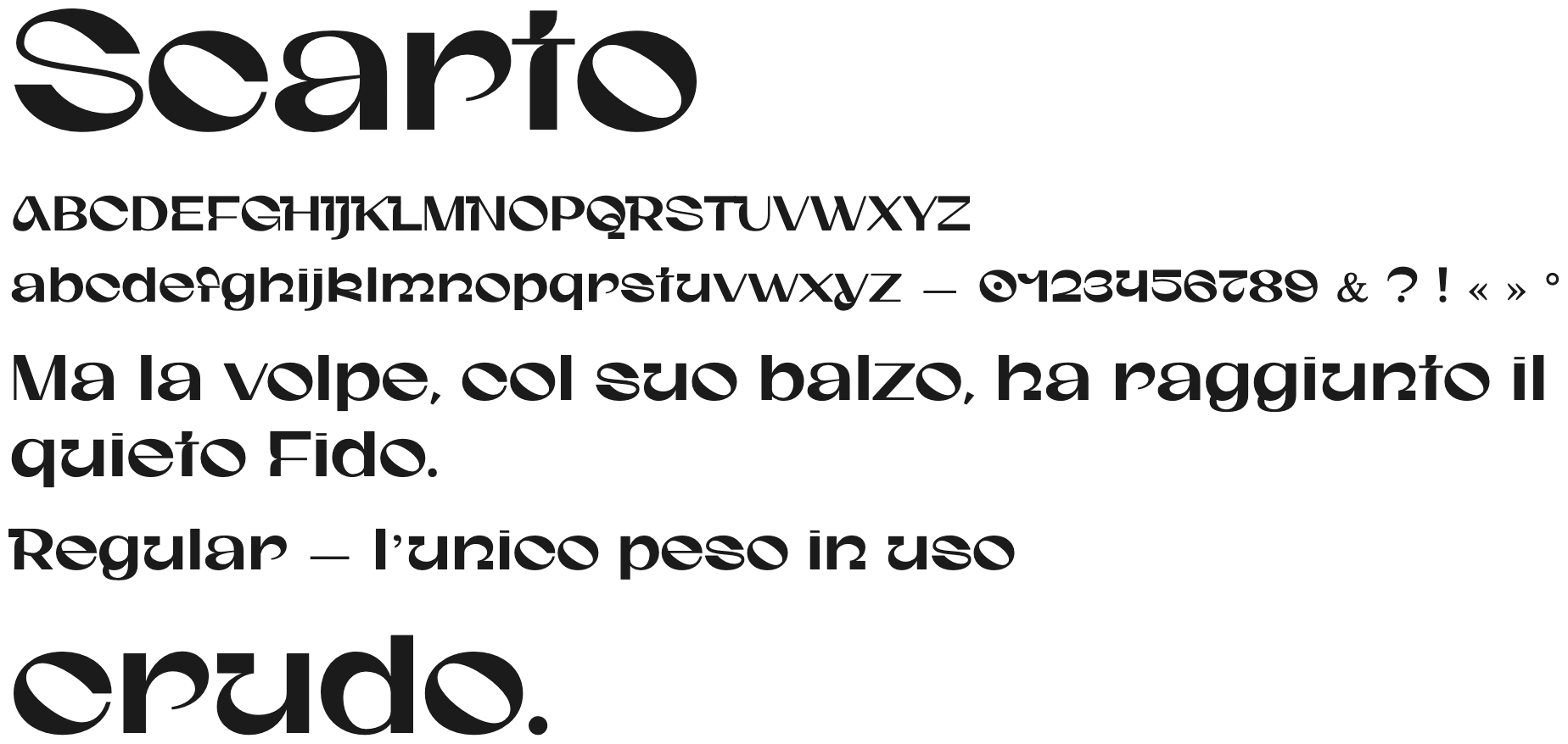
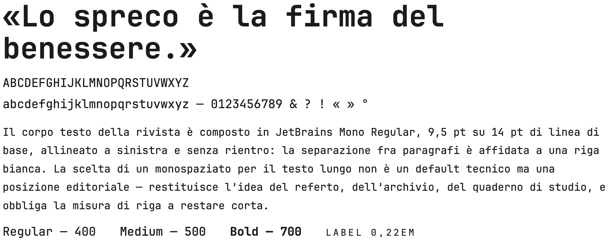
Gunter, a full geometric display, for the logo, titles and drop caps. JetBrains Mono for all the text: a monospaced face that recalls a medical report, an archive, a study notebook, and keeps the lines short.

Gunter specimen: the word Scarto, the uppercase and lowercase alphabet with figures, the sentence Ma la volpe, col suo balzo, ha raggiunto il quieto Fido, the note Regular, the only weight in use, and the logo crudo.

Gunter · display: logo, titles, drop caps

JetBrains Mono specimen: the claim «Lo spreco è la firma del benessere.», the uppercase and lowercase alphabet with figures, a paragraph of body text, and the weights Regular 400, Medium 500, Bold 700 and a spaced label.

JetBrains Mono · text, labels, metadata, campaign claims

Masthead, cover and campaign
  • Mud brownaccent #9C5E12
  • Warm blacktext #1A1A1A
  • Paperbase #FBF7EE
  • Greymetadata #888888
Sections, inside only
  • Pensiero Masticatored #E94732
  • Ritualiochre #ECB42D
  • Arte da Mangiaretaupe #84705C
  • Correnti Filosofichesage #929C84

Colour never decorates: it signals the waste on the cover, and inside it helps you find your way. Section colours appear only on opening pages and never leave the magazine.

06 · Inside the issue

68 pages, planned before the first layout

The flatplan of issue 00, with the real pages. Choose a section, or click any page to open the magazine right there.

All sections4 cover pages and 64 inside pages. Seven sections, each with its own colour on the opening page.
Leaf through the issue

Front cover

Drag a page corner, swipe on a phone, or use the arrow keys.

07 · Images

A screen between the eye and the thing

Every photograph gets the same treatment: full colour with a risograph-style halftone screen on top. Glossy photography makes waste look either appetising or repulsive. The visible dot takes away the photo's claim to truth, and leaves the text to decide whether what you see is rubbish or raw material.

Some images in the issue were generated with AI and then edited. Their origin is stated in each caption and in the colophon, as the magazine's manifesto asks.

Four inside photographs with the halftone screen: Vik Muniz's Atlas, a cook in a trattoria, rubbish bins, a bell.

Four inside pages: original colour plus halftone screen, never a duotone.

08 · Campaign

The fork that holds it all together

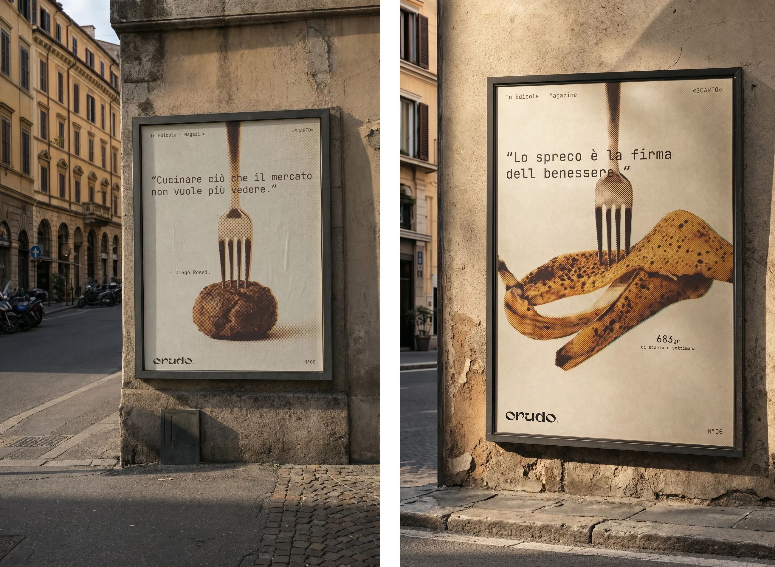
Posters for historic city walls, where the paper-coloured background matches stone and plaster. The claim takes the top band, the subject the bottom half: they never cross, so the message reads from a distance.

The billboard is the only horizontal format, so it changes grammar: three still lifes in a row, read like frames of the same gesture. Every format is recomposed, never cropped, and the subjects can change from issue to issue as long as the fork stays.

Two 100 by 140 cm posters on old city walls: one shows a bread roll pierced by a fork with the claim Cucinare ciò che il mercato non vuole più vedere, the other a banana peel with Lo spreco è la firma del benessere.

Street posters · 100 × 140 cm

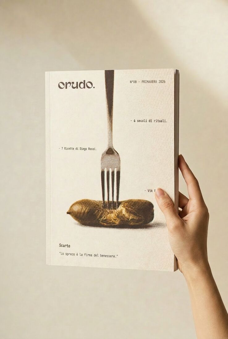
A hand holding the printed magazine.

The pilot issue in the hand

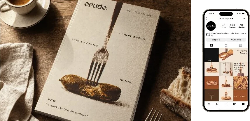
Two applications: a still life of the printed issue on a table, and the Instagram feed on a phone.

Applications · still life, 3 × 3 social feed

09 · What I'd change

Designed on one paper, printed on another

The project report specified Materica Kraft 250 g for the cover and Arena White Smooth 120 g for the inside pages. The pilot was printed on Favini Shiro Echo, made from 100% recycled fibres: 300 g/m² for the cover, 100 g/m² inside. For an issue about waste, a paper made from fibres that were already used once says the theme before a word is read.

For a magazine called "raw", paper is part of the idea: its weight, its fibres, the way it holds the halftone. Next time I would choose the paper first and design the layout on it, instead of changing it at the end.